Colour matters more than you think
Colour is about a lot more than just aesthetics or striking to your company’s branding (although both matter, of course). It’s a communication tool that works on both the conscious and the subconscious levels. Within seconds of seeing your stand, visitors can get instinctive impressions on what you’re about, just because of your colour choices.
It’s well known that colour can increase brand recognition, too. Have you ever noticed that you barely need to look at the details of the apps on your phone? The colour of the icons themselves is often all you need to see. With only six primary and secondary colours to choose from, plus black and white, it’s incredible that we can actually fine-tune our brains to recognise pretty subtle colour differences and associate them with a particular app.
That’s basically how colour works in branding, too. In the fast-paced environment of an exhibition hall, where attendees are overloaded with visual information, colour becomes your secret weapon for cutting through the noise.
But colour actually gets even more interesting when it comes to the deep, instinctive opinions people can form about you in those first few seconds. Before visitors read your company name, understand your products or talk with your staff, they’re already building a picture of what kind of business you are based solely on your colour palette. This makes colour selection not just a design choice, but a business decision that directly impacts your exhibition’s ROI.
Now, we’ll look at what individual colours mean, psychologically speaking, and how people might react to them.
The psychology of colour
As we mentioned above, different colours trigger distinct psychological responses. So knowing about colour psychology is essential knowledge for exhibition designers. You can use this understanding to guide visitors towards your goals, or to nudge them away from any presuppositions they might have about you (for example, the way an oil company might have a green logo to suggest they’re eco-friendly). Let’s look at the colours one by one, and how they speak to people.
- Red is the colour of energy, passion and urgency. It creates a sense of excitement, making it excellent for grabbing attention in crowded exhibition halls. Technology companies often use red to convey innovation and dynamism, while food brands often use its appetite-stimulating properties (can you think of a fast food chain that doesn’t have red in its logo?). However, red can also signal danger or aggression, so sometimes needs to be used subtly, rather than as the dominant colour.
- Blue represents trust, stability and professionalism. It’s a universally liked colour and is particularly effective for financial services, healthcare and technology companies. Blue creates a calming effect, like the ocean or the sky on a sunny day, and suggests reliability, making visitors feel comfortable approaching your stand. The lightness matters too. Darker blues convey authority and expertise, for example, while lighter blues feel more approachable and friendly. No wonder it’s the colour of choice for about a third of the logos of Fortune 500 companies.
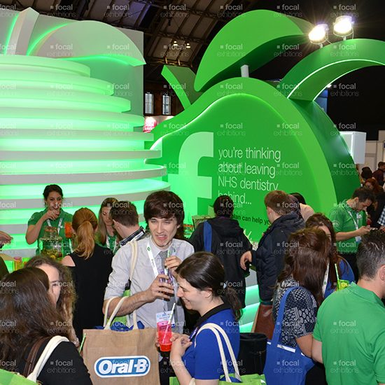
- Green symbolises growth, nature and harmony. It’s naturally associated with environmental responsibility and sustainability, making it perfect for eco-friendly brands – or at least brands that want to appear that way. Green also represents prosperity and stability, which explains its popularity in financial services. The colour is easy on the eye and creates a sense of balance, making it suitable for stands where you want visitors to feel relaxed and spend time.
- Yellow is all about optimism, sunshine, creativity and energy, but it should be used sparingly. On the plus side, it’s a very attention-grabbing colour and can make your stand appear larger and brighter. Be aware, however, that yellow can be overwhelming if overused, and may actually create a degree of anxiety in some people – in nature, yellow often means danger. It can also be difficult to make out on white backgrounds. It’s usually best when used as an accent colour to highlight key messages or create focal points within your stand.
- Orange takes the best of red and yellow, creating associations with enthusiasm, creativity and affordability. It’s particularly effective for brands targeting younger demographics or those in creative industries. Orange can also stimulate appetite and inspire impulse purchases, making it valuable for food and retail brands.
- Purple has been associated with luxury, creativity and sophistication from at least as long ago as the Romans. It’s quite rare in nature, giving it an otherworldly quality that can make brands appear premium. Purple works well for beauty, fashion and luxury goods. That can actually be a drawback if you’re absolutely not a luxury brand, as it can make bargain-hunters think twice about visiting your store. Remember, these are split-second decisions, not informed, researched opinions.
- Black represents sophistication, elegance and power. It’s timeless and works well for luxury brands, though it can feel cold or intimidating if not balanced with warmer colours. Black is excellent for creating contrast and making other colours appear more vibrant.
- White symbolises purity, simplicity and cleanliness. It creates a sense of space and allows other colours to shine. Note that white alone can feel sterile (which may or may not be what you’re going for), but it’s invaluable for creating a clean, modern aesthetic when combined thoughtfully with other colours and text.
- Gold and silver represent luxury, prestige and premium quality. Gold conveys warmth, success and achievement, making it ideal for high-end brands and celebratory messaging. Silver suggests modernity, innovation and sophistication with a cooler, more technological feel than gold. Both metallic colours work excellently as accent colours to add glamour and perceived value to your stand. Use them sparingly, however, as things can quickly look garish, pretentious and (paradoxically) cheap, especially with gold.
The colour wheel
Understanding the colour wheel is useful for creating harmonious and impactful colour schemes. It’s among the first things design students learn, because it informs a good deal of what they will go on to do. The wheel organises colours by their relationships to each other, creating a template for combinations that work naturally together. As a designer, using the wheel can lighten your workload immensely, but there can also be value in purposely ignoring its rules.
- Complementary colours sit opposite each other on the wheel – red and green, blue and orange, purple and yellow. These combinations create high contrast and visual interest, making them excellent for grabbing attention. However, they should be used sparingly, as too much contrast can be overwhelming or create visuals that are uncomfortable to look at. It’s sometimes good to have your stand’s main scheme as the complementary to your logo’s colour. That’s not a hard and fast rule, but one that’s worth exploring.
- Analogous colours are neighbours on the wheel and create harmonious, pleasing combinations. Examples include blue, turquoise and green, or red, reddish-orange and orange. These schemes feel natural and cohesive, making them ideal for stands where you want visitors to feel comfortable. They can usually quite comfortably be the dominant colour schemes.
- Triadic colours are evenly spaced (120°) around the wheel, creating vibrant yet balanced combinations. Red, yellow and blue form a primary triadic scheme, while orange, purple and green create a secondary triadic combination. But you don’t have to stick with primary or secondary schemes – there are infinite triadic colour schemes to choose from, which offer good contrast while maintaining harmony.
- Split-complementary schemes use one colour plus the two colours adjacent to its complement. For example, blue with red-orange and yellow-orange. This approach provides contrast, but there’s a bit less tension than with true complementary schemes.
When applying a colour wheel to exhibition stands, consider using one colour as dominant, another as secondary and a third as an accent. The 60-30-10 rule works well: 60% dominant colour, 30% secondary colour and 10% accent colour.
Industry colour associations
Over the decades, different sectors have developed colour conventions that create immediate recognition. Knowing these associations helps you communicate with your target audience. It’s up to you whether you conform to or deliberately contrast with industry norms.
- Technology traditionally favours blues and whites, suggesting innovation, reliability and cleanliness. However, many tech companies now use bold colours like red, orange or green to stand out and appear more approachable. The key is balancing credibility with differentiation.
- Healthcare relies heavily on blues and whites to convey trust, hygiene and professionalism. Green is also popular for its associations with growth and nature. Avoid colours like black or red that might create negative health associations or even death.
- Financial services predominantly use blue, green and conservative colours like navy or grey. These choices reinforce messages of stability, growth and no-nonsense trustworthiness. While some financial brands use warmer colours to appear more approachable, credibility is vital when you’re handling people’s money.
- Food and drink industries tend to have colours that stimulate appetite, which is why reds, oranges and yellows are so common. Green works well for healthy or organic products, while brown can suggest a natural, farmer’s-market vibe.
- Environmental and sustainability sectors naturally gravitate toward greens and earth tones. These choices immediately communicate environmental responsibility and harmony. There’s definitely room for bucking the trend though, especially if you want to be environmental and dynamic.
- Luxury goods often employ black, purple, gold or deep, silky colours that suggest exclusivity and premium quality. The goal is to create an aspirational feeling, so premium pricing feels natural. Think about how supermarkets brand their premium ranges compared to the cheap and cheerful stuff.
Using colour to stand out
In crowded exhibition halls, standing out is vital. Colour provides one of the most effective ways to differentiate your stand, but the approach requires careful planning.
Start by researching your competitors’ typical colour choices, both in general and at exhibitions specifically. If your industry predominantly uses blue, for example, a well-executed warm colour scheme might help you stand out.
Unusual colour combinations can create memorable impressions – but only when executed skillfully and thoughtfully. These combinations are unusual for a reason, and might be jarring or inappropriate. The key is to look for surprises that enhance, rather than undermine, your brand message.
Don’t forget about colour intensity and saturation. They differentiate your stand even when using similar hues to competitors. A vibrant, saturated blue will feel very different from a muted, pastel blue, even though both are technically the same colour.
Remember that your objectives are the most important driver here. If differentiation comes at the expense of trust or accepted industry communication, it may ultimately harm rather than help your exhibition.
Materials matter
Colour theory is all well and good, but it still has to translate into the reality of your exhibition stand. Colours aren’t just abstract concepts. They are inherent aspects of the objects in your stand – the walls, the furniture, the floors, the displays, the uniforms.
The materials themselves play a huge part in how colour plays out. If the materials look cheap and shoddy, it hardly matters what colour they are. Some materials are reflective, while others absorb and diffuse light, so the same colour on different surfaces can actually look like different colours.
Don’t forget about lighting, too. If your lighting has any colour hue at all, it will greatly affect the appearance of coloured objects. You can conceivably use whites and greys for your stand, and rely on the lighting to bring out the colour, but this can be a complex operation, and relies heavily on you having complete control over ambient light, which is all but impossible.
Draft in the experts
This guide should serve as a basic introduction to colour theory for exhibition stands. Professional designers spend years training and then using colours, and it’s a truly underrated skill.
We would always recommend hiring a freelance designer or stand design business to help with your colour scheme. If you can find someone who is familiar with your industry, that’s even better. Use mockups and visualisation to get a better feel for how your stand will look, and make sure you act on the feedback you get from those activities – they’re not meant to represent the finished product.
Now, armed with your plans, it’s time to approach a professional exhibition stand fabricator to start turning your beautifully coloured designs into reality.
